Brand Identity · PR & Marketing · Barranquilla

jump.

The brand that activates everything.
Brand Identity PR Agency Stationery Brand Activation Barranquilla
ClientClienteCliente
Jump
LocationUbicación
Barranquilla, CO
ScopeAlcance
Identity · Stationery · Motion
DivisionDivisiónDivisión
Brandnew

A complete brand identity system for Jump — a fearless PR and brand activation agency based in Barranquilla, Colombia. A brand built to move fast, hit hard, and leave a mark on every surface it touches.

Un sistema completo de identidad de marca para Jump — una agencia de PR y activación de marca sin miedo con sede en Barranquilla, Colombia. Una marca construida para ser imposible de ignorar.

Un sistema completo de identidad de marca para Jump — una agencia de PR y activación de marca sin miedo con sede en Barranquilla, Colombia. Una marca construida para ser imposible de ignorar.

1
Wordmark. Infinite energy.
3
Brand colors. Razor focused.
360°
Identity system: print, digital, motion
Brand activations powered
The BriefEl BriefEl Brief

A PR agency that doesn't
ask for permission.

Jump was founded to disrupt the way brands activate in Colombia's Caribbean coast. They needed an identity as loud and kinetic as their work — something that could live on a business card, fill a wall, and animate into a reel.

Jump fue fundada para disruptar la forma en que las marcas se activan en la Costa Caribe de Colombia. Necesitaban una identidad tan llamativa y cinética como su trabajo — algo que los anunciara antes de que entraran a la habitación.

Jump fue fundada para disruptar la forma en que las marcas se activan en la Costa Caribe de Colombia. Necesitaban una identidad tan llamativa y cinética como su trabajo — algo que los anunciara antes de que entraran a la habitación.

The ChallengeEl RetoEl Reto
"Build a brand that feels like it's always in mid-air — always jumping."
"Construir una marca que se sienta como si siempre estuviera en el aire — siempre saltando."
Most PR agencies dress conservatively — safe logos, corporate palettes, forgettable business cards. Jump wanted the opposite: a system so distinct that every piece of collateral becomes a statement. The brand had to work equally well at human scale (a business card handed over at a client meeting) and at monumental scale (a 10-meter activation wall).
The ApproachEl Enfoque
"One ultra-condensed serif wordmark, cropped at the edge, always about to escape the frame."
"Un logotipo serif ultra-condensado, recortado en el borde, siempre a punto de escapar del marco."
We built the identity around a single typographic gesture: the "jump" wordmark set in a heavy condensed serif with extreme weight contrast, cropped and scaled so aggressively it feels like it's bursting off every surface. The teal accent — a single paint-stroke mark — adds the human touch. A tightly constrained palette of black, white, and teal does the rest.
Jump brand stationery system — letterhead, business cards, notebooks
Design System

Typography as energy

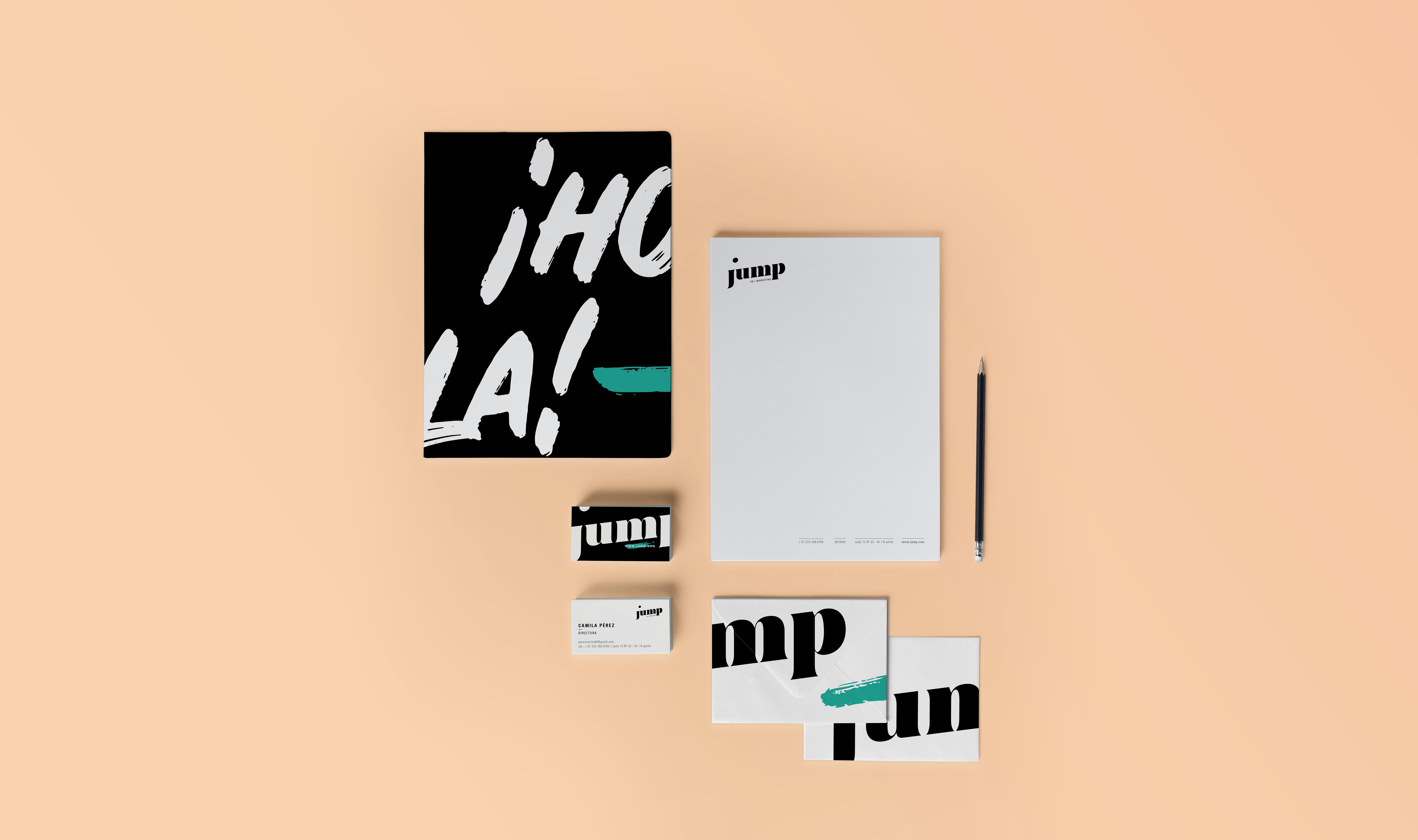
The identity is almost entirely typographic. The wordmark IS the visual system — scaled up, cropped, rotated, mirrored, and multiplied across every application. The teal brushstroke is the only decorative element, and it always appears as an accent, never a fill.

jump
jump
PR · Marketing · Brand Activation · Barranquilla
The wordmark uses a high-contrast condensed serif — wide strokes against hairline strokes — creating a natural kinetic tension. Set in deep black. Never tracking adjusted. Always lowercase.
Jump Black
#0e0e0e
Primary · Wordmark · Type
Pure White
#ffffff
Reverse applications
Jump Teal
#3abfb1
Accent · Brushstroke · URL chip
Warm Cream
#f5ede2
Background · Print surface
01
The Wordmark
A single lowercase "jump" in a heavy condensed serif — always set at the edge of its space, never centered with breathing room. Its power is in its refusal to be contained. Scale it up and it becomes architecture. Scale it down and it's still immediately legible.
02
The Teal Brushstroke
A single hand-painted teal mark — appearing on the back of business cards, as a URL chip, as a swipe across collateral. It signals energy without being decorative. It's the human handwriting of the brand — proof that Jump is made by people, not algorithms.
03
Crop as a System
The primary graphic tool is aggressive cropping. The wordmark is never shown complete on large-format pieces — it's always escaping the frame. Business cards show just "mp." or "jum" — fragments that are instantly recognizable because the brand is that distinctive.
Jump business cards scattered — showing front and back system
"
A brand that jumps off every surface it lands on — from a business card to a 10-meter activation wall.
Brandnew Studio — Jump Identity, Barranquilla
Brand in Motion
Deliverables

What we delivered

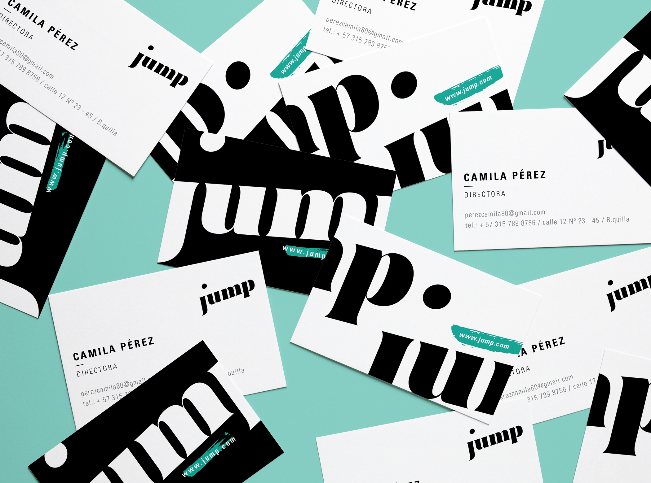
A complete brand system — from the foundational logo lockup to animated motion assets and print-ready stationery.

Brand Foundation
  • Primary wordmark + logomark system
  • Full color system + usage rules
  • Typography hierarchy
  • Brand guidelines document
Print Collateral
  • Business cards (front + back system)
  • Letterhead + stationery suite
  • Brand notebook / folder covers
  • Envelopes + mailers
Digital & Motion
  • Animated logo reel (JUMP1 + JUMP2)
  • Social media templates
  • Digital brand asset pack
Activation Support
  • Large-format print templates
  • Event backdrop system
  • Brand activation visual toolkit
← Previous project
Lavi
Packaging · Food & Beverage
Next project →
Gifted Breads
Brand Identity · Chicago