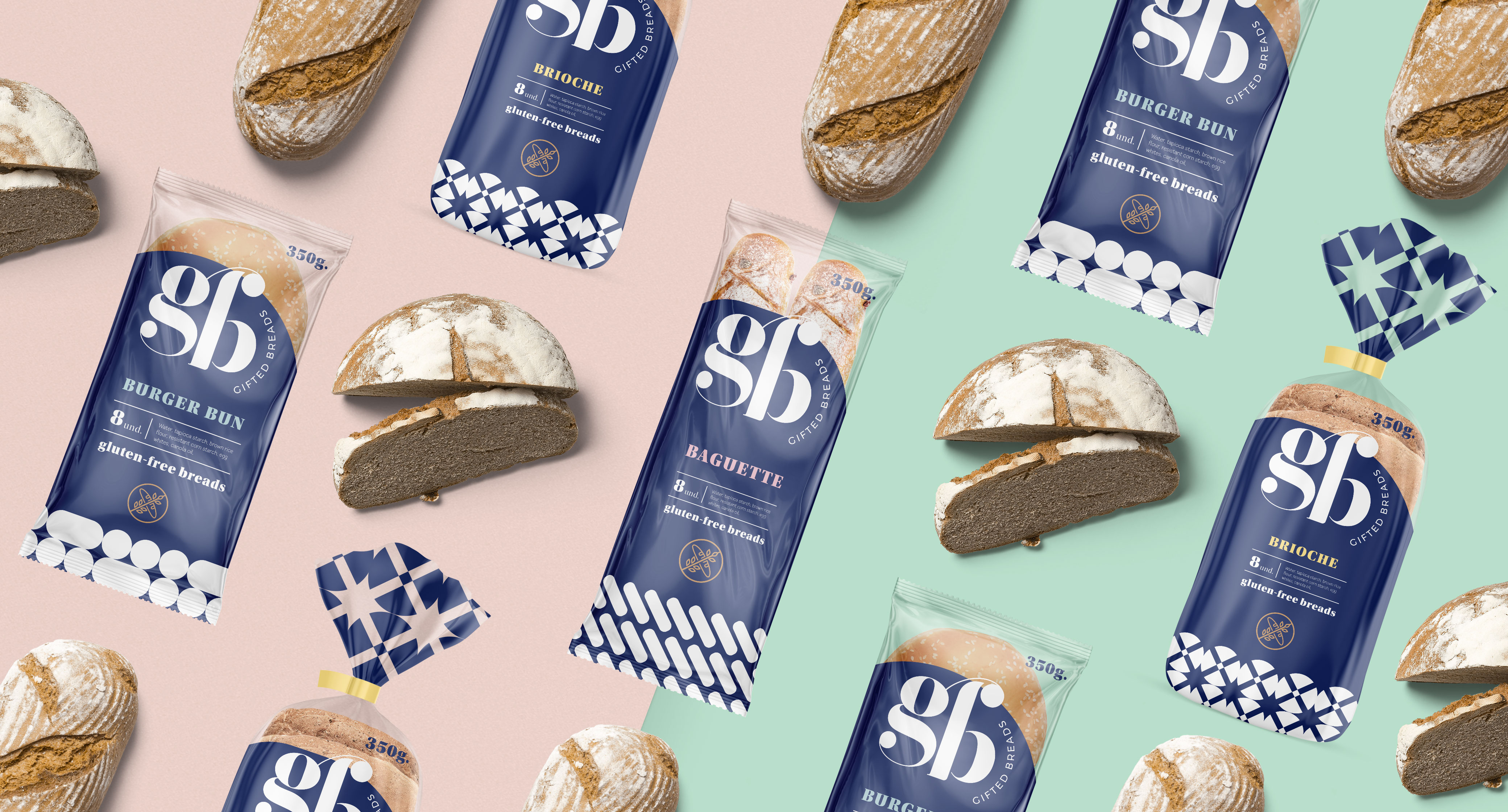
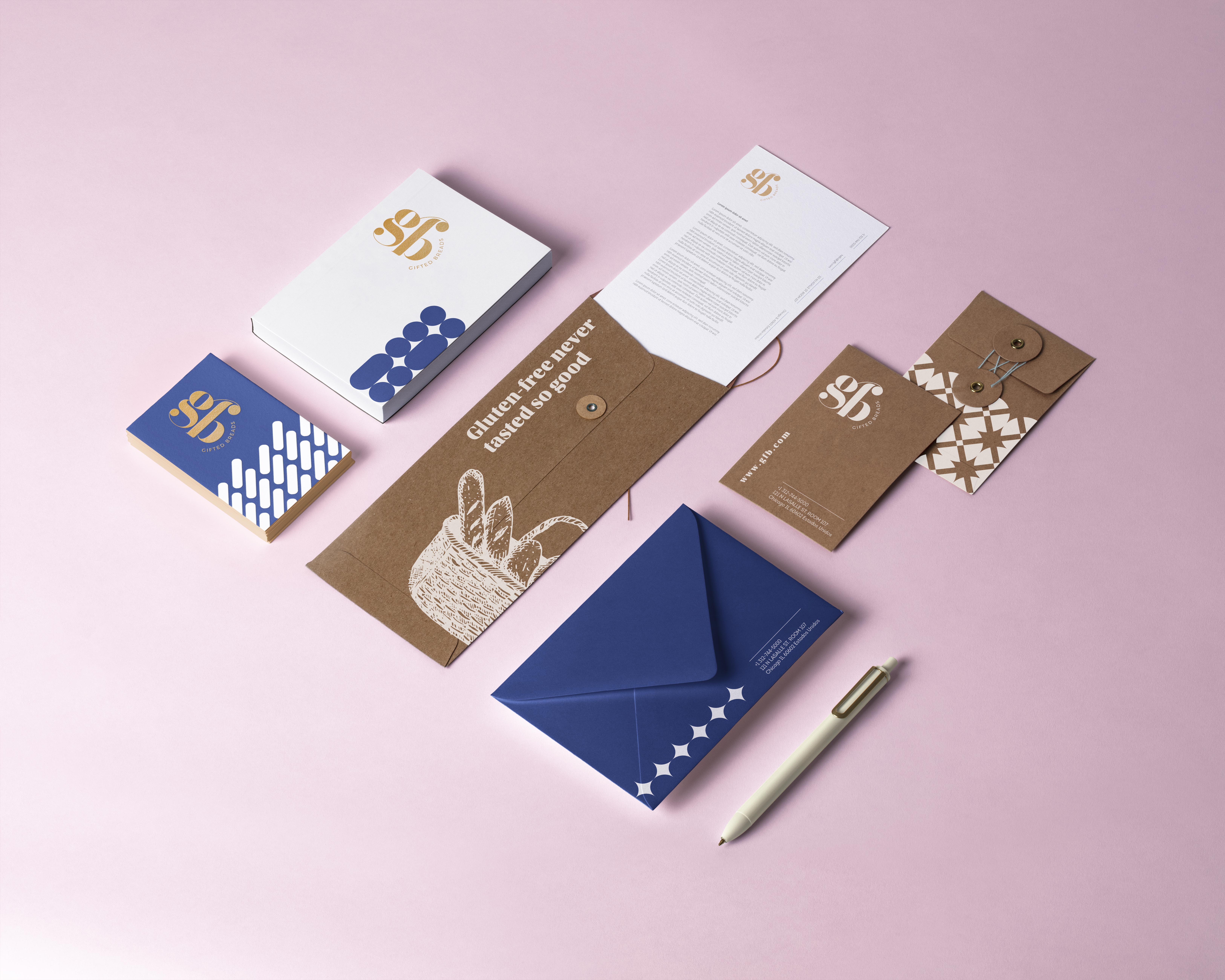
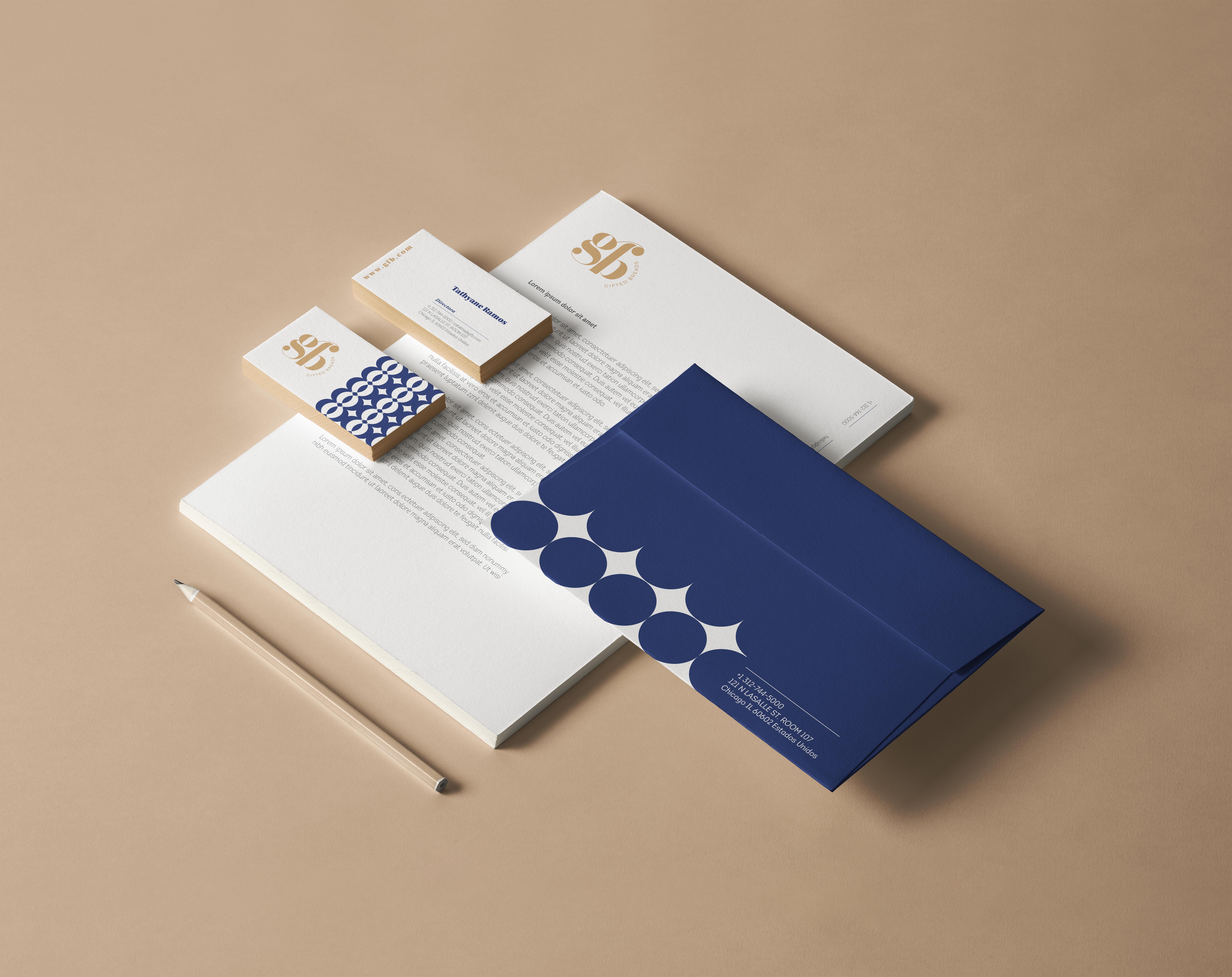
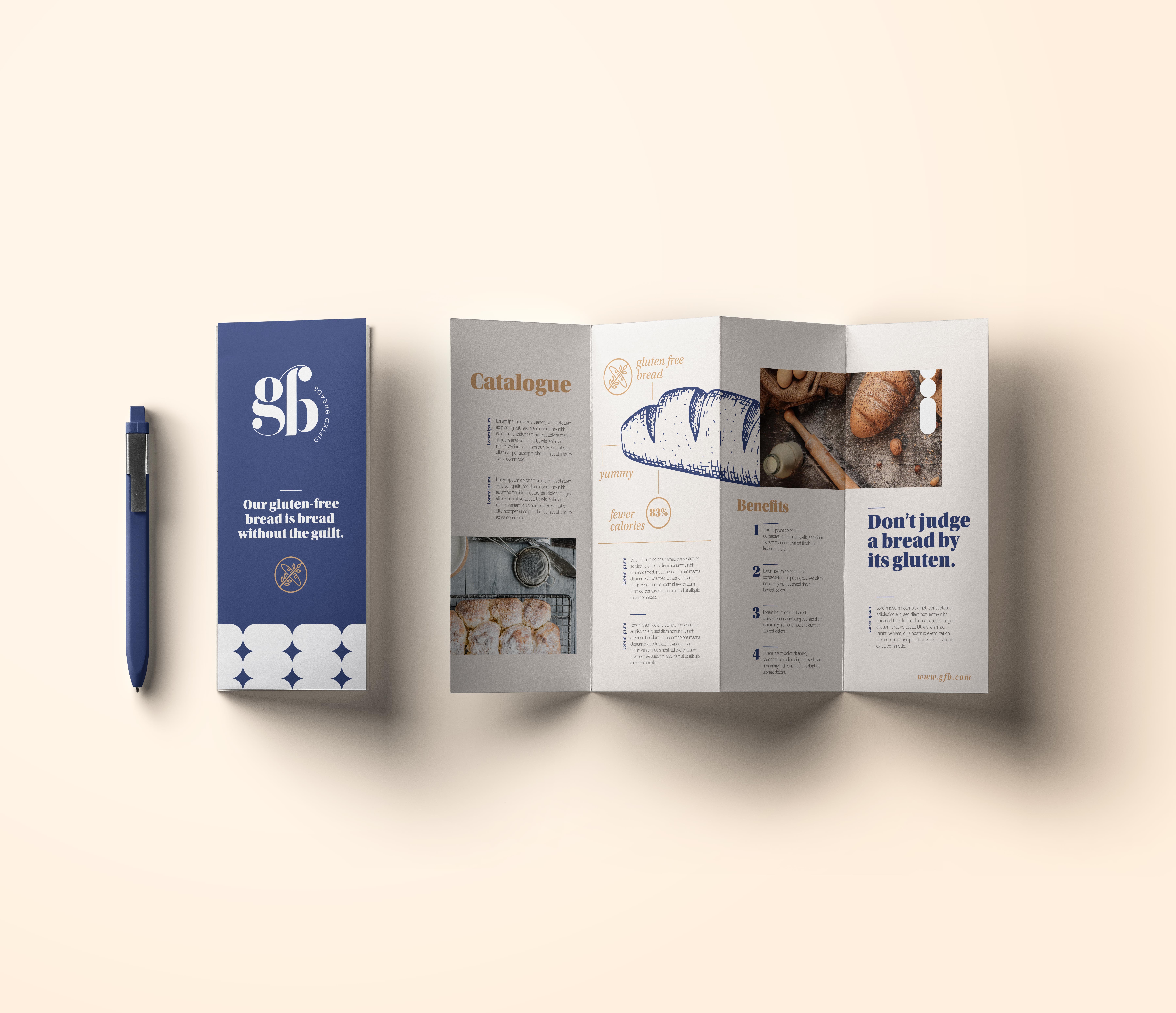
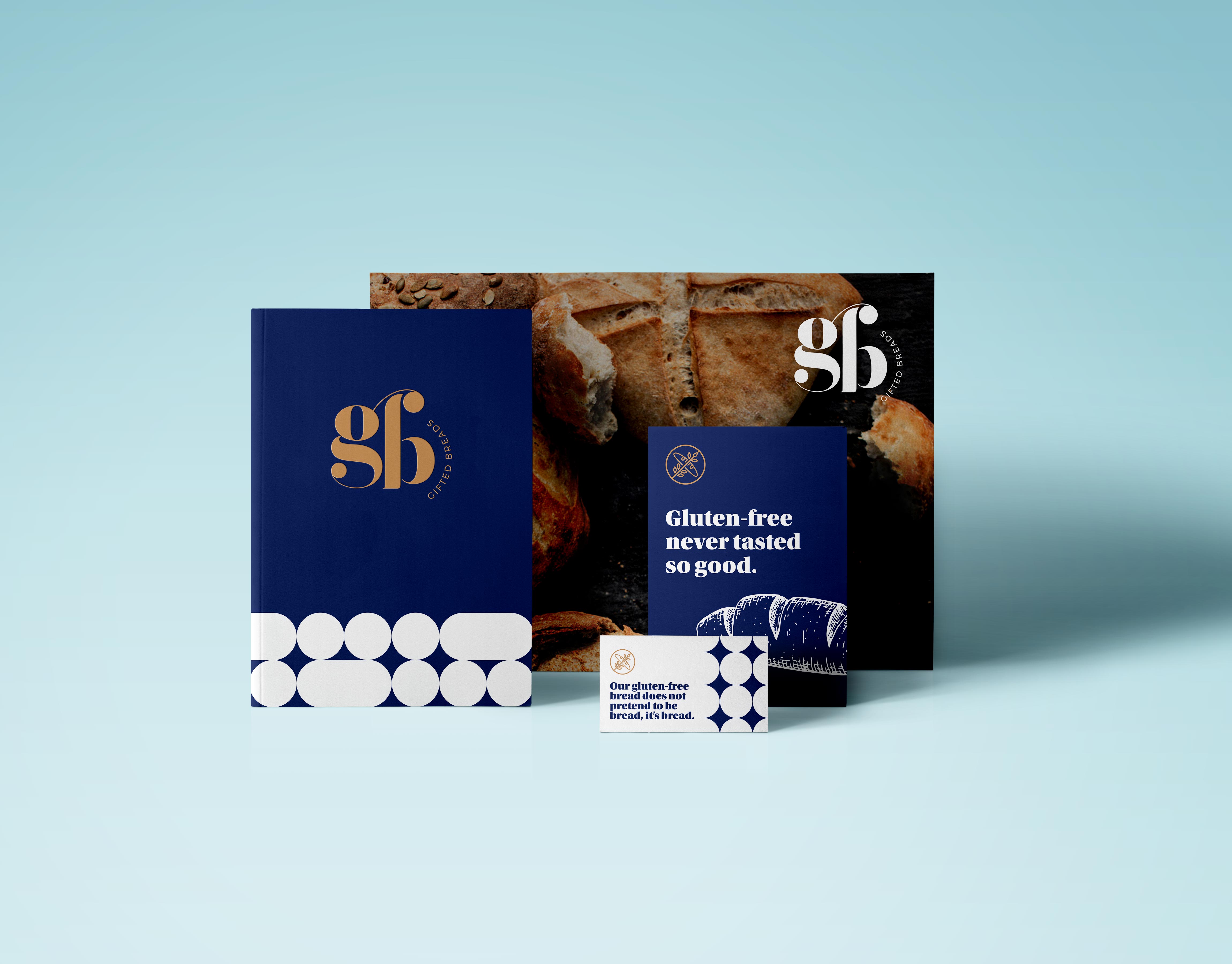
Gluten-free never tasted so good.
A complete brand identity, packaging system, stationery suite, and web presence for a Chicago-based gluten-free bakery that refuses to let "gluten-free" mean "flavour-free." Wit included at no extra charge.
Una identidad de marca completa, sistema de empaque, suite de papelería y presencia web para una panadería sin gluten con sede en Chicago que se propuso demostrar una cosa: que el pan sin gluten puede ser genuinamente delicioso.
Gifted Breads set out to prove that gluten-free bread doesn't have to taste like a science experiment. They needed a brand as confident and craft-forward as their product — premium enough for the speciality aisle, warm enough for the kitchen table.
Gifted Breads se propuso demostrar que el pan sin gluten no tiene que saber como un experimento científico. Necesitaban una marca que los posicionara en el extremo premium del mercado de panadería especializada — no en el ghetto de los "alimentos saludables".
Each SKU in the Gifted Breads lineup carries the same deep navy bag with the oversized "gb" monogram — plus a geometric pattern at the base that varies subtly by product. The flavor descriptor sits in gold on navy. Crisp, premium, shelf-stopping.
From letterhead to kraft mailers, every touchpoint in the Gifted Breads ecosystem carries the same rigour. The monogram, the geometric pattern, the navy-and-gold combination — applied consistently from the business card you hand at a tasting to the envelope your wholesale partner receives.
The Gifted Breads copywriting strategy is built on a single premise: we don't apologise for being gluten-free, we swagger about it. Every headline is written to disarm, delight, and make you want to buy a loaf immediately.
The palette is deliberately limited: deep navy as the authority colour, antique gold as the craft signal, warm cream and kraft as the tactile warmth. Every application uses this system — nothing else.