Brand Identity · Social Impact · Latin America & Caribbean

Acceso.

Local food from local farmers.

Clinton Foundation Food Security Agricultural Development El Salvador · Haiti · Colombia
ClientClienteCliente
Acceso
Context
Clinton Foundation Initiative
ScopeAlcanceAlcance
Brand Identity · Creative Ops
DivisionDivisiónDivisión
Brandnew

A complete brand identity and ongoing creative operations system for Acceso — a Clinton Foundation initiative working with smallholder farmers across Latin America and the Caribbean to build sustainable food markets, grow local economies, and create dignified livelihoods for rural communities.

Una identidad de marca completa y sistema de operaciones creativas continuas para Acceso — una iniciativa de la Fundación Clinton que trabaja con pequeños agricultores en América Latina y el Caribe.

Una identidad de marca completa y sistema de operaciones creativas continuas para Acceso — una iniciativa de la Fundación Clinton que trabaja con pequeños agricultores en América Latina y el Caribe.

3+
Countries: El Salvador · Haiti · Colombia
Farmers empowered. Markets opened.
5
Brand colours — one per mission pillar
>>
The double-chevron mark. Always forward.
The Mission

A brand built to
open doors.

Acceso means "access" in Spanish — and the organisation's entire purpose is encoded in that single word: access to markets, access to buyers, access to technical knowledge, access to a dignified income. The brand needed to be as direct, energetic, and forward-moving as that mission.

Acceso significa "access" en español — y todo el propósito de la organización está codificado en esa sola palabra: acceso a mercados, acceso al conocimiento, acceso a los sistemas económicos que históricamente han excluido a los pequeños agricultores rurales.

Acceso significa "access" en español — y todo el propósito de la organización está codificado en esa sola palabra: acceso a mercados, acceso al conocimiento, acceso a los sistemas económicos que históricamente han excluido a los pequeños agricultores rurales.

The Organisation
"We connect smallholder farmers to the markets that need them — and teach them to thrive there."
"Conectamos a los pequeños agricultores con los mercados que los necesitan — y les enseñamos a prosperar allí."
Acceso is a social enterprise operating under the Clinton Foundation's economic development portfolio. Working across El Salvador, Haiti, Colombia, and beyond, Acceso builds market systems: connecting smallholder farmers directly to institutional buyers, supermarkets, and export channels — cutting out predatory middlemen, raising incomes, and creating food security at scale. Their work is simultaneously local and global, technical and deeply human.
The Creative Challenge
"Build a brand that speaks to farmers, foundations, and governments — all in the same breath."
"Construir una marca que le hable a agricultores, fundaciones y gobiernos — todo en el mismo aliento."
Acceso's communications audience is genuinely plural: rural farmers in El Salvador who see campaign posts in Spanish, institutional donors and development organisations who review annual reports in English, Haitian community members who read materials in Haitian Creole, and government partners who assess programme impact in formal settings. One brand system had to work across all of these contexts — energetic enough to feel alive on social media, credible enough to sit in a boardroom presentation.
Acceso brand mark — chevron double arrow on deep forest green, lime yellow
Brand Identity

The chevron that never stops moving.

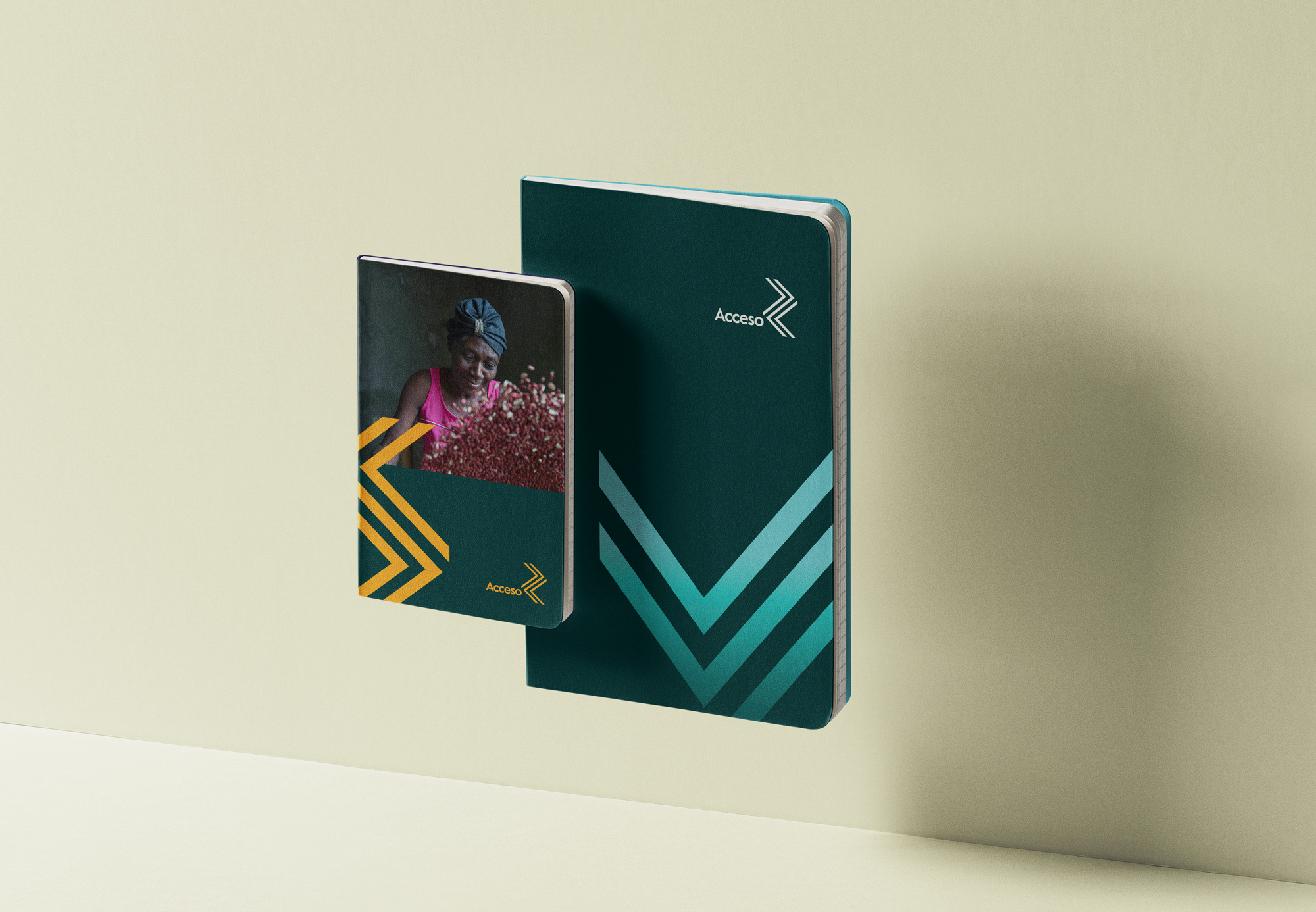
The Acceso brand mark is a double-chevron — two forward-pointing arrow forms interweaved — on a deep forest green. It's a mark about direction, progress, and the energy of a growing movement. At every scale from a fridge magnet to a billboard, it reads as motion.

01
The Double Chevron
Two chevron forms in counterpoint — one pointing right (forward, export, opportunity), one pointing left (inward, community, roots). Together they form an X-like crossing that reads as connection: between farmer and market, between local and global, between present and future.
02
Forest Deep as Foundation
The primary brand background is a deep forest green — the colour of productive land, growing crops, and environmental sustainability. It positions Acceso firmly in the agricultural territory it works within, while giving the lime and teal accents a stage to perform on.
03
Multi-Accent Colour System
Five accent colours — lime, teal, amber, magenta, cyan — allow different programmes and campaigns to have their own visual identity while remaining within the Acceso family. Each colour can lead a specific campaign theme, market segment, or country programme without breaking the system.
Acceso notebooks — forest green with teal chevron, and photo cover with amber chevron
Social Content System

Content that honours
the people it's about.

Acceso's social content is built around a simple principle: the farmers are the heroes. Every post template centres a real human face, a real field, a real moment — with the graphic system providing structure without overwhelming the story. The brand's bold chevron forms and multi-accent palette make content instantly recognisable across all five country contexts.

Acceso — Seguimos trabajando para alimentar a El Salvador. #somosacceso
El Salvador · #somosacceso · Feeding communities
Acceso — Investments in agriculture post: peanuts with magenta chevrons
Agriculture investment advocacy · Magenta system
Extensio Acceso — The gift of food is a gift of love and hope · Teal quote card
Extensio · Quote card · Mint green · Food as love
Acceso Exports: Fruit with Purpose · Orange on forest green
Acceso Exports · Fruit with Purpose · Amber system
Día mundial de la alimentación · #héroesdelaalimentación · Smallholder farmer portrait
World Food Day · #héroesdelaalimentación · Lime system
Colour System

Five colours. Five frontlines.

Each accent colour maps to a distinct area of Acceso's work — and gives content creators a clear, intuitive system: when you're talking about exports, use amber. When you're talking about community food security, use teal. When you're talking about market systems growth, use lime. The system scales across geographies, languages, and media.

Forest Deep
#0b3d2e
Primary · All formats
Lime Active
#c8e020
Growth · Market systems
Teal Impact
#00c8a0
Community · Food security
Amber Export
#f0a020
Exports · Trade · Premium
Magenta Advocacy
#e020c0
Policy · Advocacy · Attention
Cyan Digital
#20d4e8
Digital channels · Tech
Brand in Motion
Programmes & Platforms

One organisation. Many access points.

Acceso operates multiple distinct programmes and sub-brands within its umbrella — each with their own campaign voice, audience, and geographic focus. The brand system is designed to give each programme visual independence while maintaining the Acceso parent identity.

Food Security
Feeding local communities — from local fields
The core Acceso programme works with smallholder farmers to supply local institutional buyers — school feeding programmes, hospitals, government food distribution — with produce grown within the same communities that consume it. The teal system anchors this programme: it's about circulation, nourishment, community loops.
Market Development
Acceso Exports: Fruit with Purpose
The exports programme connects Acceso farmers to international markets — particularly fresh fruit and specialty crops. The amber and lime accent systems mark export-facing content: premium, global, value-added. "Fruit with Purpose" is the campaign tagline: every purchase has a social return at the farm level.
Digital Extension · Extensio
Extensio — Agricultural knowledge, delivered
Extensio is Acceso's digital extension service: a mobile-first platform delivering technical agricultural advice to farmers via SMS, app, and community networks. The Extensio sub-brand uses the teal mint palette and the double-chevron mark to signal forward momentum and knowledge-sharing. "The gift of food is a gift of love and hope."
Advocacy · #somosacceso
"We are still working to feed El Salvador."
The campaign content for #somosacceso centres the farmers themselves as protagonists and advocates. Community-shared posts of farmers holding seedlings, women laughing in harvest, men working in greenhouses — captioned with the direct, first-person voice of people who feed their nations. The magenta and cyan systems signal this advocacy content.
Acceso tote bag — multilingual: English, French, Spanish, Haitian Creole. Local food from local farmers. Partnership: WCK, HRO, CORE, Acceso
Multilingual Design

One bag. Four languages.
One truth.

The Acceso food distribution tote bag is one of the most quietly powerful pieces in the system: a black canvas bag carrying the same message in four languages simultaneously — designed for Haiti, where the communities being served speak English, French, Spanish, and Haitian Creole. Every partner logo sits at the base: World Central Kitchen, Haitian Relief Organisation, CORE, and Acceso.

English: Local food from local farmers.
French: Produits locaux de fermiers locaux.
Spanish: Comida local de agricultores locales.
Creole: Manje lakay ki soti nan jaden lakay.
Mission Impact

The numbers behind the brand.

Acceso's brand exists in service of a mission — and the mission is measured. Every campaign, every piece of creative, every tote bag handed out at a food distribution point is connected to a real farmer, a real harvest, a real income.

10K+
Smallholder farmers in the programme network
$40M+
In farmer income generated across programmes
3
Countries: El Salvador · Haiti · Colombia
4
Languages in active brand communication
Meals from locally-grown food distributed
Acceso · Clinton Foundation · Latin America & Caribbean
A brand that doesn't just represent an organisation — it represents every farmer who has ever fed a country without recognition.
Brandnew Studio — Acceso Brand Identity & Creative Operations
← Previous project
Alpina Navidad
Christmas Campaign · OOH
Next project →
Pérez López
Legal Identity · Criminal Defence