Strategy · Brand · UI/UX · OOH · Uniforms · Colombia
tualy

Tu versión preferida de ti.

Beauty & Wellness Marketplace Colombia · tualy.co Radical Inclusion
ClientClienteCliente
Tualy
Country
Colombia
ScopeAlcance
Full scope
DivisionDivisiónDivisión
Uppipe
Tualy app — three iPhones showing splash screen, services grid (Barbas, Pestañas, Depilación), and Uñas menu
🎯
Strategy &
Workshops
🎨
Brand
Identity
📱
UI / UX
App
📣
OOH
Campaign
👕
Uniforms &
Merch
📲
Social &
Digital
🖨
Print &
Stationery
0→1
Strategy workshops to full brand launch
Services: Barbas · Uñas · Pestañas · Peinados · Depilación
2
Campaign lines — one for clients, one for stylists
♂♀
The first beauty marketplace truly for everyone
The BriefEl BriefEl Brief

Beauty was never just
for women.

Tualy started as a challenge of radical inclusion. The beauty and wellness marketplace category was dominated by pink, feminine, exclusionary aesthetics — built for a narrow idea of who cares about their appearance. Tualy was designed from the ground up to be different: a brand for everyone who has a body and takes care of it.

Tualy comenzó como un reto de inclusión radical. La categoría de marketplace de belleza y bienestar estaba dominada por códigos visuales rosados, femeninos y excluyentes. Tualy quería romper eso — un marketplace donde cada colombiano que se cuida a sí mismo se siente visto.

Tualy comenzó como un reto de inclusión radical. La categoría de marketplace de belleza y bienestar estaba dominada por códigos visuales rosados, femeninos y excluyentes. Tualy quería romper eso — un marketplace donde cada colombiano que se cuida a sí mismo se siente visto.

The Strategic Challenge
"How do you build a beauty brand that men don't run away from — without losing the women who've always been there?"
"¿Cómo construyes una marca de belleza de la que los hombres no huyan — sin perder a las mujeres que siempre han estado ahí?"
The deep dive workshops uncovered the core problem: the beauty services market in Colombia was growing, but it was segmented, informal, and heavily gendered. Men were visiting barbers and beauty salons in increasing numbers but encountering brands that made them feel unwelcome. The opportunity was a platform that could serve everyone — not by erasing gender from the equation, but by refusing to make it the only thing. From "la manicurista" to "tu ritual semanal de cuidado personal."
The Brand Strategy
"From la manicurista — to the platform for everyone who takes care of themselves."
"De la manicurista — a la plataforma para todos los que se cuidan a sí mismos."
Two audiences, two campaign voices, one brand. For clients: "Encuentra algo que te gusta de ti, todos los días" — an invitation to self-discovery and joyful self-care. For beauty professionals: "Ayúdanos a provocar más sonrisas frente al espejo. Elige el sueldo que quieres cada mes" — empowerment, professional dignity, economic autonomy. Tualy positioned itself not as a booking app but as a partner in the wellbeing economy: for the person receiving care, and the person providing it.
Brand Motion — Tualy Vol.1
The Old World

Beauty was a closed door.

The Colombian beauty services category before Tualy was highly fragmented: neighbourhood salons serving women, barberías serving men, nail technicians working informally from home. No unified platform. No professional infrastructure. No brand that looked and felt like it served everyone.

Feminine by default — pink, script fonts, flower imagery
Informality — no booking, no guarantees, no standards
Fragmented — no platform connecting clients and professionals
Gendered exclusion — men visible in market data, invisible in the brand world
The Tualy Way

Wellbeing is for everyone.

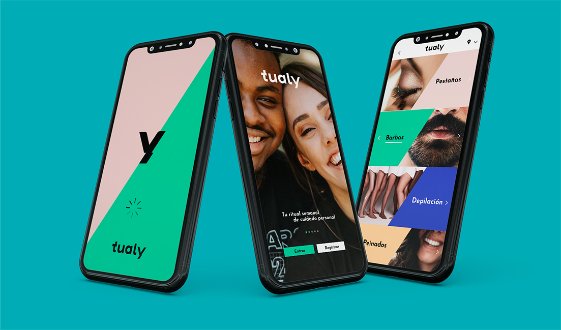
Tualy's visual language was designed to be neutral without being cold — geometric, graphic, playful. The brand uses a colour system rather than a single colour: mint for freshness, pink for warmth, blue for trust, yellow for joy. No colour owns the brand. The brand owns them all.

Geometric, not pretty — angular colour blocks, bold type, no florals
Multi-colour system — no gender assigned to any accent colour
Both voices — client campaign and stylist recruitment campaign simultaneously
Service-first UI — Barbas, Uñas, Pestañas, Peinados, Depilación — all equal
Tualy app — three phones showing splash screen, onboarding, and home with Barbas and Pestañas service categories
The App — Client View
Splash · Onboarding · Services grid · Service menu
Tualy Instagram story ad — woman smiling, green diagonal, 'Encuentra algo que te gusta de ti, todos los días'
Instagram Story — Campaign
"Encuentra algo que te gusta de ti, todos los días." · Sponsored
Brand Identity

The geometry of personal care.

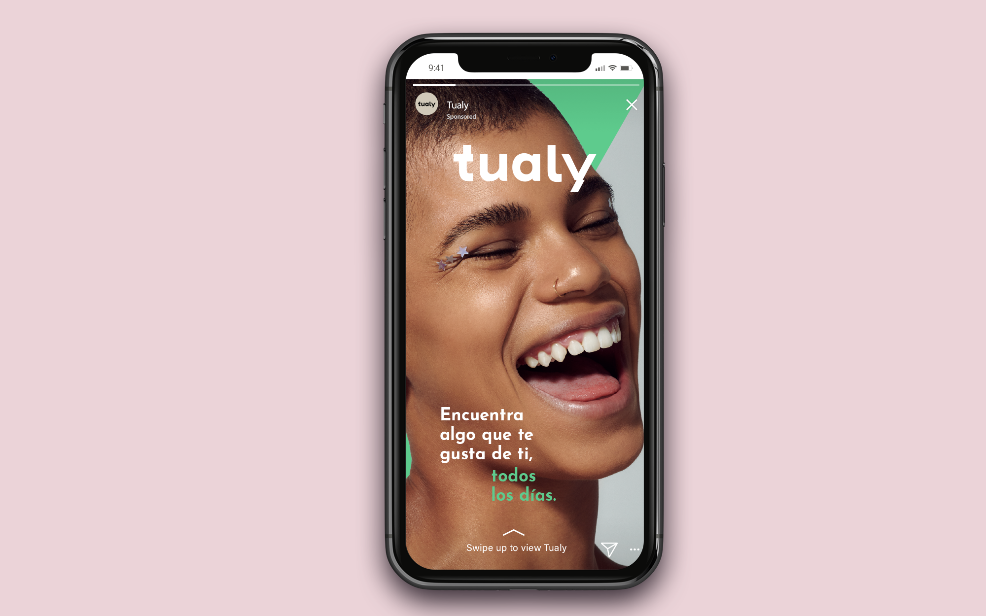
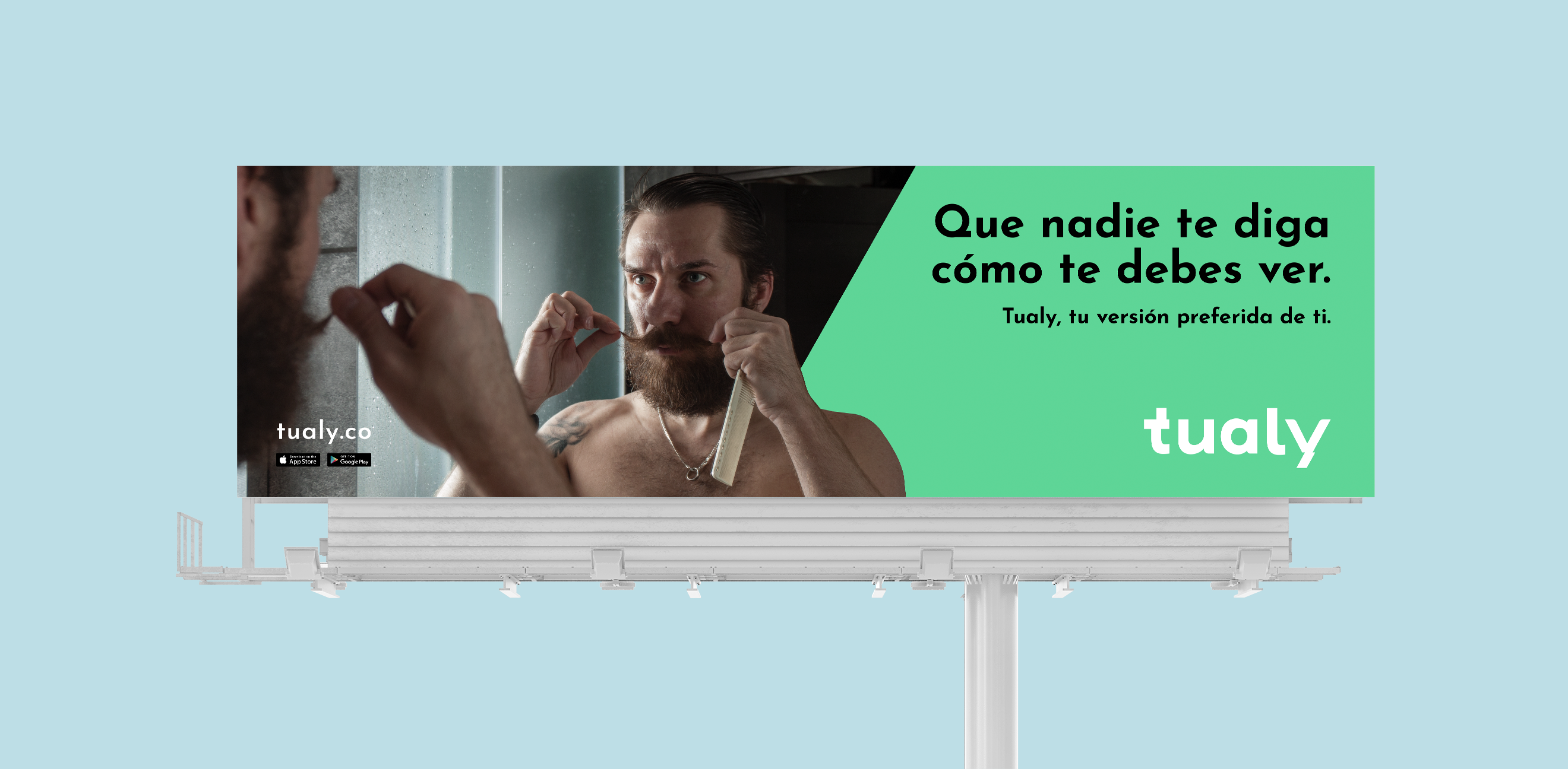
The Tualy identity is built on a simple but radical visual idea: the diagonal. A bold diagonal colour block separates every surface — letterhead, envelope, backpack, uniform — into two zones. The geometry is clean, flexible, and completely free of beauty-category clichés. The wordmark is lowercase, rounded, friendly, and utterly ungendered.

La identidad de Tualy está construida sobre una idea visual simple pero radical: la diagonal. Un bloque de color diagonal en negrita separa cada composición — dividiendo el espacio, creando energía, negándose a quedarse quieto. Funciona en todos los géneros, en todos los servicios, en toda Colombia.

La identidad de Tualy está construida sobre una idea visual simple pero radical: la diagonal. Un bloque de color diagonal en negrita separa cada composición — dividiendo el espacio, creando energía, negándose a quedarse quieto. Funciona en todos los géneros, en todos los servicios, en toda Colombia.

01
The Wordmark
Lowercase "tualy" in a rounded geometric sans — warm enough for the care category, clean enough for a tech platform. The "y" is the brand's most distinctive character: its descender becomes a standalone mark when isolated, acting as a monogram at any scale. Tu + aly: the possessive "tu" (your) embedded in the name itself.
02
The Diagonal System
A 45° diagonal colour block runs across every branded surface — the front pocket of the backpack, the thigh panel of the uniform, the flap of the envelope, the bottom third of the letterhead. It's the brand's structural fingerprint: the instant signal that makes Tualy identifiable at a glance, on any surface, in any context.
03
The App UI
The app uses the same diagonal geometry as the identity — each service category has its own colour block behind the head photograph of the model. Barbas (green), Pestañas (pink), Depilación (blue), Peinados (yellow). Swipe left to browse services. The interface is a photo gallery with prices and a booking CTA. Beauty, made accessible.
Campaign Motion — Tualy Vol.2
Tualy stationery — letterhead, envelope with green diagonal, business cards in beige and blue, green pen, salmon background
Stationery Suite
Letterhead · Envelope · Business cards × 2 variants · Pen
Tualy backpack — beige canvas with green diagonal panel and oversized 'y' mark on side
Branded Backpack
Canvas · Diagonal panel · Oversized 'y' monogram · Merch
Tualy uniforms — two headless mannequins in beige scrub tops with 'tualy' embroidered, and diagonal colour panel masks: pink left, green right
Tualy uniform trousers close-up — diagonal colour panel detail, pink left / green right, 'tualy' wordmark in panel
Uniform Design

The stylist is the brand.

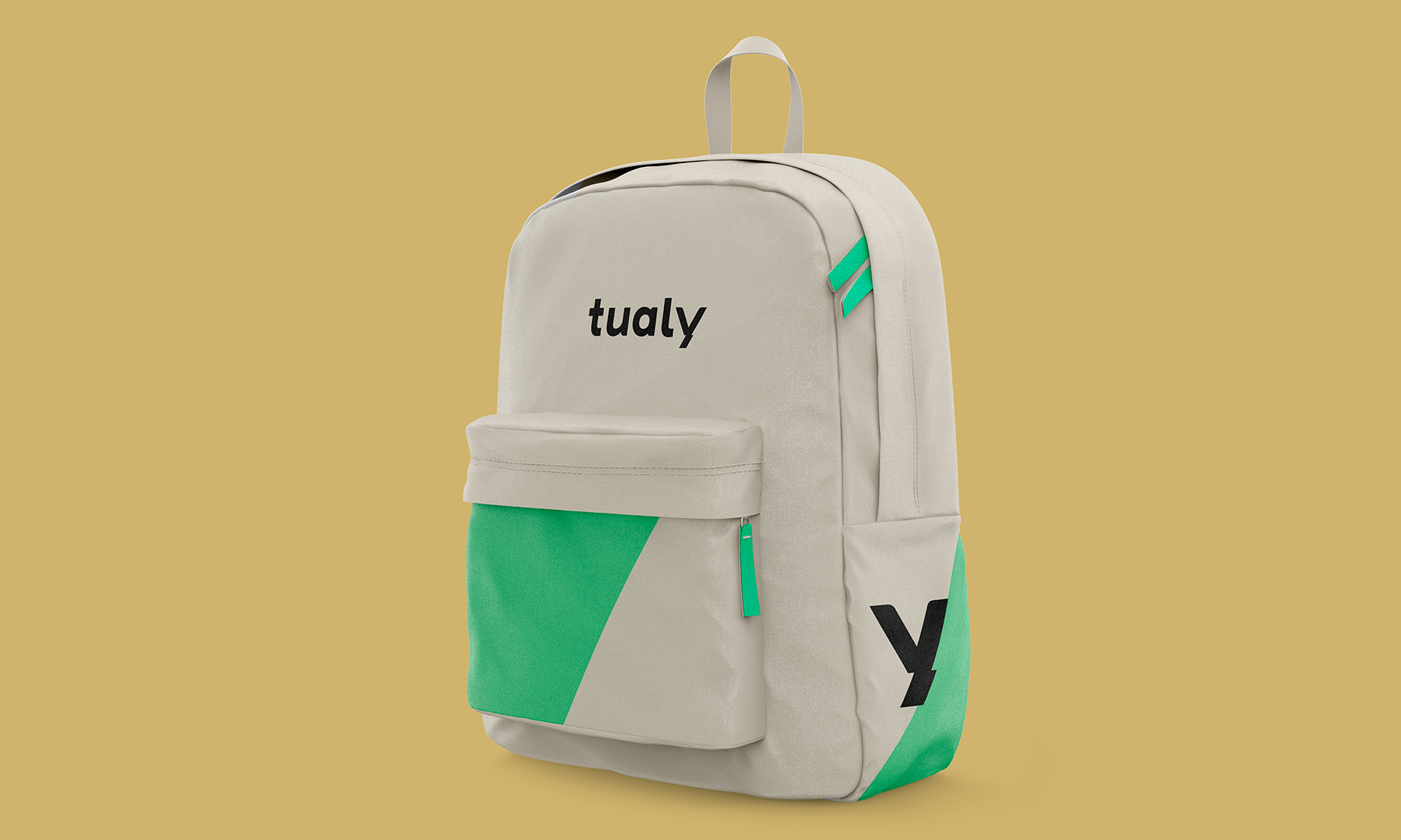
Tualy's uniform system turns every beauty professional into a walking expression of the brand — and gives them a choice. The base uniform is the same for everyone: beige, clean, professional, gender-neutral scrub. The colour that differentiates: a diagonal panel on the trousers and a matching split mask, available in either pink or mint green. The stylist chooses their colour. Their identity, their choice.

Pink Variant
Rosa — Calidez
The pink diagonal panel and matching split mask signal warmth, approachability, and care. This variant is often chosen by professionals in nail, eyelash, and skincare services — but the choice is always the stylist's, never the service category's.
Green Variant
Verde — Energía
The mint green diagonal signals energy, freshness, and confidence. Most visible in barba and depilación specialists, but again: the stylist decides. The two uniforms together make the brand's multi-colour system visible in physical space — every appointment is a brand moment.
The Philosophy
Tualy recruits too.
"Ayúdanos a provocar más sonrisas frente al espejo. Elige el sueldo que quieres cada mes." The billboard campaign for stylists used the uniform itself as a creative element — a Tualy professional in full uniform, smiling, with the economic empowerment message. The brand recruits its own workforce through OOH.
Tualy billboard — man trimming beard with comb, 'Que nadie te diga cómo te debes ver', green right panel, tualy wordmark white
"Que nadie te diga cómo te debes ver."
Client campaign · Male inclusion · tualy.co
Tualy billboard — Tualy stylist in uniform, 'Ayúdanos a provocar más sonrisas frente al espejo', white background, recruitment campaign
"Ayúdanos a provocar más sonrisas frente al espejo."
Stylist recruitment · "Elige el sueldo que quieres cada mes" · tualy.co
Tualy billboard variant 2 — same man beard campaign, horizontal format, teal bg
"Tualy, tu versión preferida de ti."
Brand line · Client campaign · All formats
Tualy billboard variant 2 — stylist recruitment, horizontal format, white bg, larger scale
"Elige el sueldo que quieres cada mes."
Stylist campaign · Economic empowerment · tualy.co
Brand Motion — Tualy Vol.3
Colour System

No colour owns the brand.
The brand owns them all.

Tualy's multi-colour system is the clearest expression of its inclusion philosophy. Unlike a mono-colour brand, Tualy uses five distinct accent colours — each one assigned to a different service category in the app, interchangeable in the identity system, equally valid in campaign materials.

Tualy Mint
#2dd68a
Primary · Barbas · Wordmark bg
Tualy Pink
#ff4d88
Uniform · Pestañas · Warmth
Tualy Blue
#3060e8
Depilación · Trust · Business card back
Tualy Yellow
#f0c840
Peinados · Joy · Accent
Warm Cream
#f8f4ee
Stationery · Uniform base · Surfaces
Near Black
#181818
Wordmark · Body type · All surfaces
Tualy · Colombia · Beauty + Wellness + Inclusion
From workshops that challenged everything the beauty category assumed — to a brand that made everyone feel like the person it was built for.
Brandnew Studio + Uppipe — Tualy Brand System
← Previous project
Tiptap
Kids Fintech · Panama · Full Scope
Back to all work →
Portfolio
View all projects