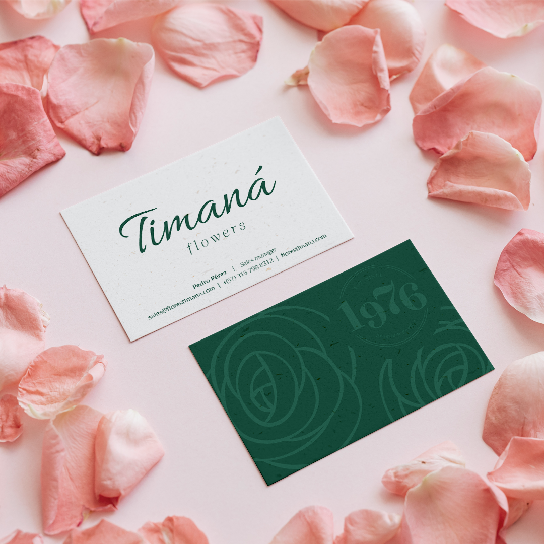
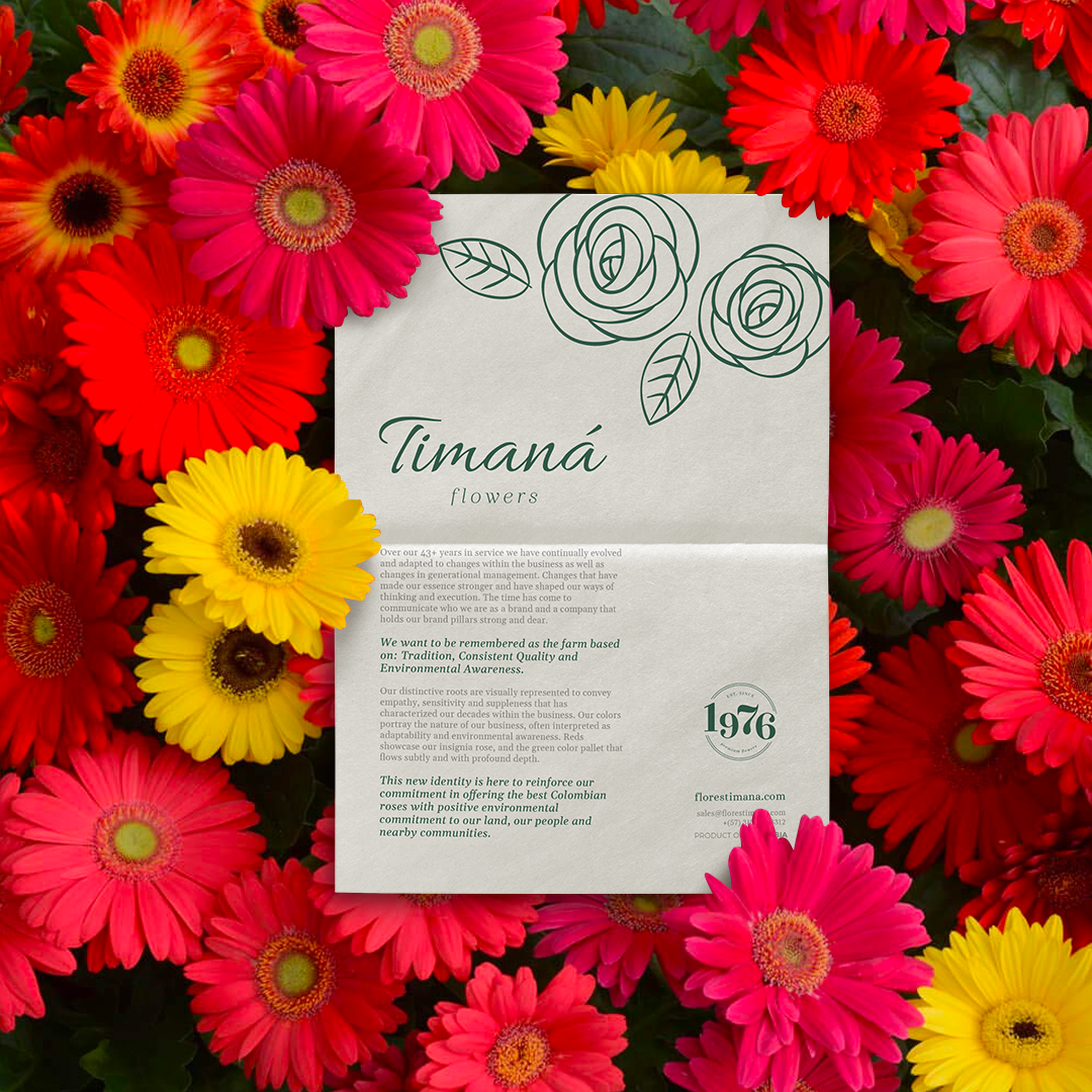
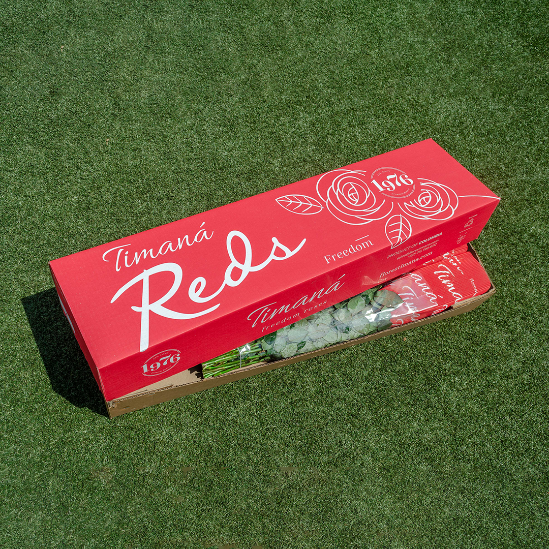
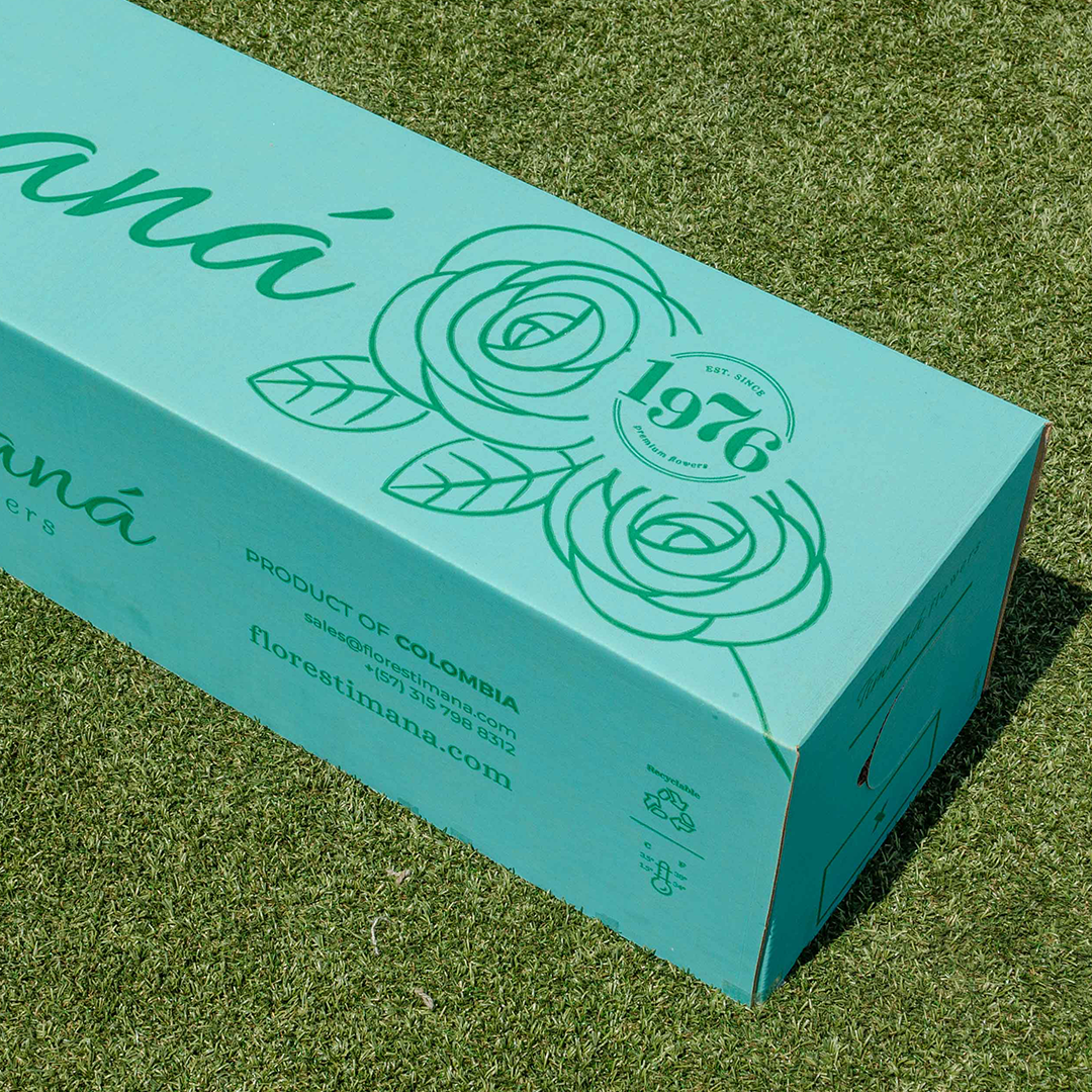
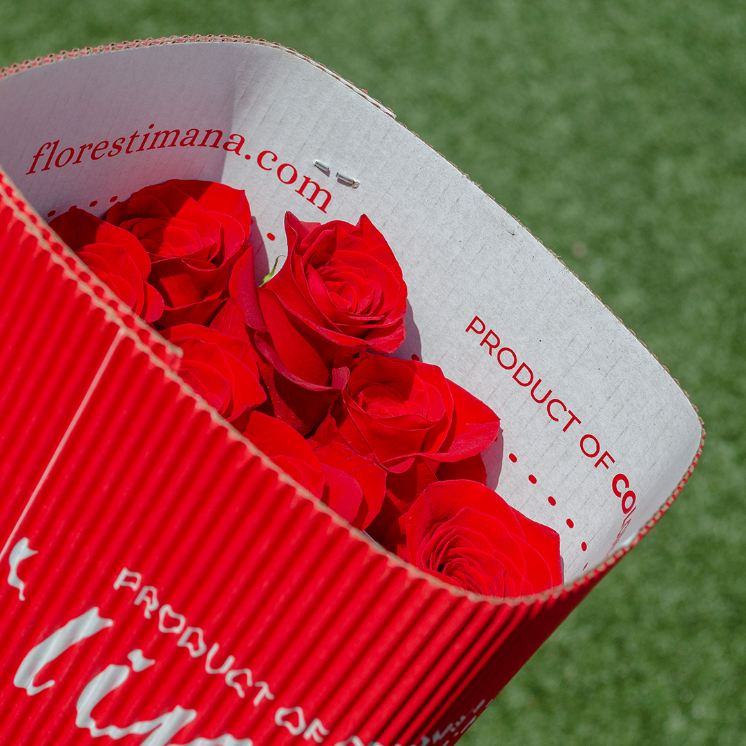
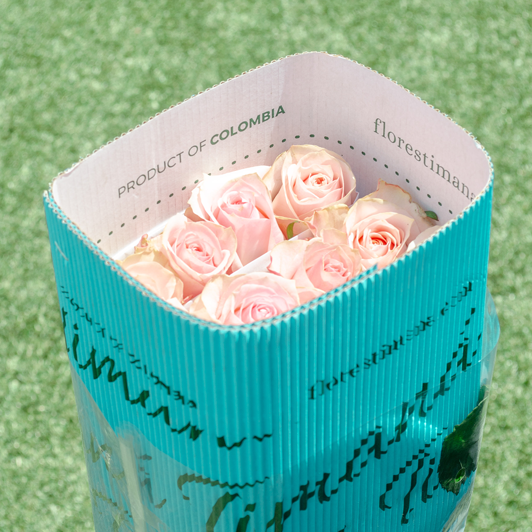
A new identity for a 56-year-old Colombian rose exporter — built on three brand pillars: tradition, consistent quality, and environmental awareness. florestimana.com
Una nueva identidad para un exportador colombiano de rosas de 56 años — construida sobre tres pilares de marca: tradición, calidad consistente y la línea continua de compromiso que nunca se ha roto.
Timaná has been growing and exporting premium Colombian roses since 1976 — through generational changes, industry shifts, and a world that increasingly demands both beauty and responsibility. This rebrand didn't invent a new brand. It revealed the one that was always there.
Timaná ha estado cultivando y exportando rosas colombianas premium desde 1976 — a través de cambios generacionales, cambios en la industria y evoluciones del mercado global. El reto: comunicar esa continuidad como un activo, no como una edad.
When a Timaná box arrives at a wholesale market in Miami or a flower shop in Amsterdam, it's the first physical encounter with the brand. The packaging was designed to be photographed, recognised, and remembered — a display object as much as a shipping container.
The Timaná brand comunicado — a printed manifesto sent to buyers and trade partners — articulates the three pillars that define the farm and its identity. Not marketing language. A statement of genuine character, 56 years in the making.
The continuous-line rose illustration is the identity system's most distinctive element — a single unbroken stroke forming two roses with leaves. Drawn to reference both botanical illustration and artisan craft, it appears at every scale: small on the business card, monumental on the shipping box, as a ghost pattern on the card back.
The "1976" heritage seal grounds the brand in time — not as a nostalgia play, but as a statement of durability. In a volatile export category where farms come and go, 56 years is a competitive asset. The seal makes it visible.
Alongside the visual identity, Brandnew wrote and designed the Timaná brand comunicado — a printed document sent to wholesale buyers, importers, and florist partners introducing the new identity and articulating the farm's values.
The Timaná palette is extracted directly from the farm: the deep forest green of the stem, the crimson of the Freedom rose, the teal of the irrigation pond at midday, the soft pink of the petals. The brand is a portrait of the land it comes from.